Help Center Refresh
Bringing Platform Conformance to Global Feature
In this case study, we explore the integration of the Platform Help Center into an omnichannel presence across both legacy and ZAIDYN tools. This initiative aligns the Help Center with the Design System where possible and simplifies the navigation from a dropdown to a collapsible side panel, enhancing usability and cohesion across the platform.
Challenge: Low Lift Solution
Creating the Platform Help Center on a legacy stack posed significant challenges. The limitations and inflexibility of the old system required innovative, low-lift solutions. We had to ensure enhancements in user experience and system compatibility without extensive overhauls. Aligning the design with modern standards and simplifying topic selection, we delivered a solution that streamlined the user interface while maintaining the integrity of the legacy infrastructure.
ROLE
UX MANAGER
Feedback Facilitation
Feedback Facilitation
Research Synthesis
Design Strategy
Project Scope
Adoption Plan
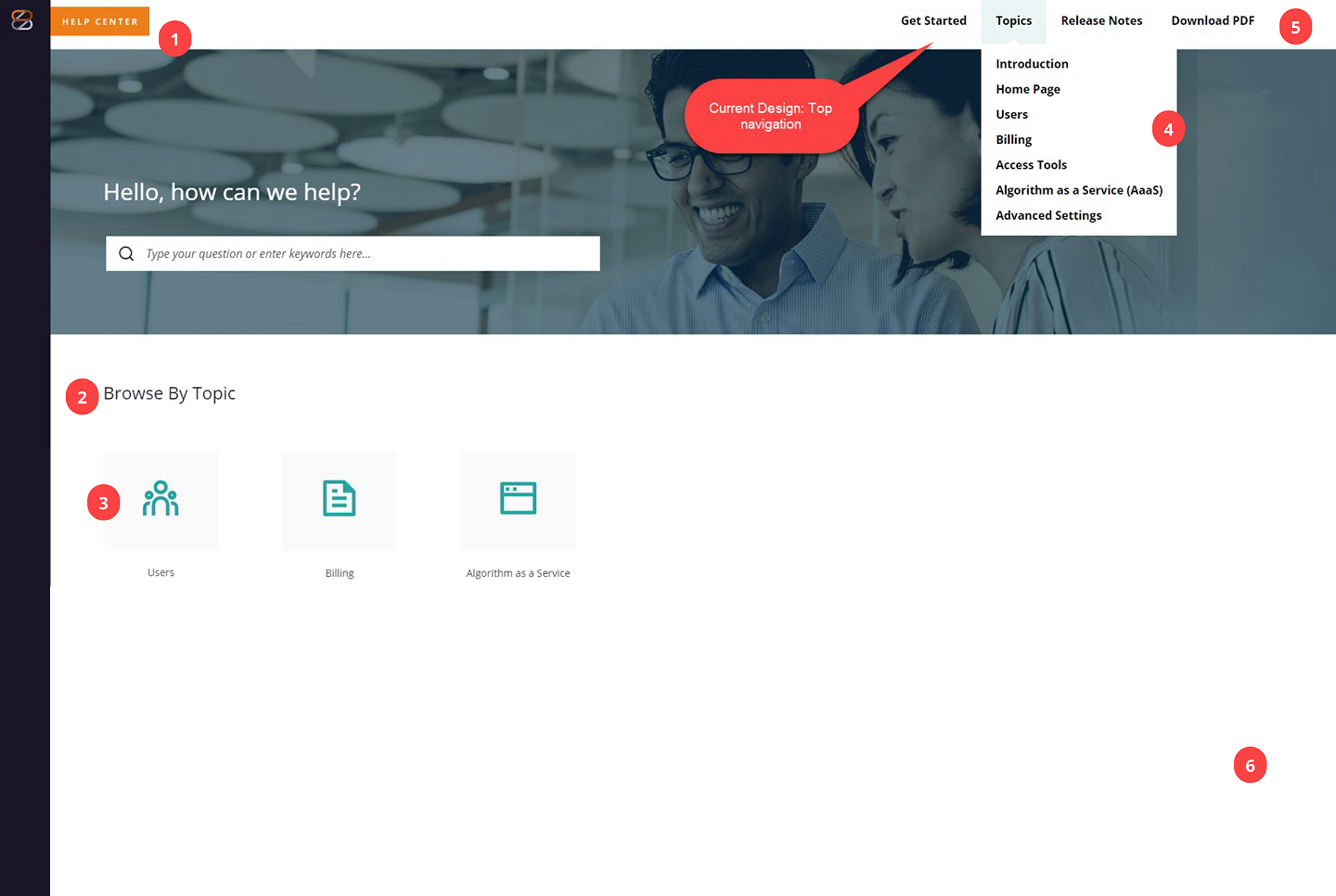
The Before
The current Help Center layout lacks clear organization, making it difficult for users to find relevant information quickly. The product-specific sections are not well defined, and the navigation feels cluttered. The content also lacks consistency in formatting and structure, creating a less-than-optimal experience for users looking for quick answers.
Concerns/Tips:
1. No mention of which product this Help Center section is for.
2. Are #2 and #4 the same?
3. Opportunity to use ZDS component.
4. PM has mentioned Topic list can get pretty lengthy and have a maximum of 5 words.
5. Should Download PDF be a CTA?
6. White Space, any opportunities here?
We leveraged metrics and product management (PM) documentation to identify pain points and user needs within the existing design. By analyzing usage data, such as page visit frequency, time spent on help articles, and support ticket trends, we identified areas where users were struggling to find information quickly. Additionally, insights from PM documentation, including product goals and feedback, helped us align our UX recommendations with the broader business objectives. This data-driven approach guided us in suggesting improvements like streamlining content, simplifying navigation, and introducing more intuitive, consistent design elements to enhance user experience.
Proposed Enhancements
After surveying user needs and journey mapping documented by product managers we were able to better prioritize.
Improving the flow:
•Remove Download all Topics in PDF format from top navigation, add to body and include a description of what will happen when they download
•Aligns Browse by topic cards to ZDS component.
•Add information label above search to inform user where in platform they are.
•Topics Collapsible Side Panel:
• Individual Topic PDF download

Default view
Although the help center is housed in a legacy API we were able to leverage UI elements from the Design System:
•Primary Navigation
•Informational Badge
•Type Styles
•Collapsible Side Panel
•Accordion with action button
•Card with icon

Topics column is expanded upon click
Key Benefits
• Improved User Experience: A well-organized information architecture makes it easier for users to find relevant help articles quickly, reducing frustration and increasing overall satisfaction with the platform.
•Scalability & Consistency: Templetizing the help center across a legacy application system ensures a consistent layout and content structure, making future updates easier to implement and the platform more scalable.
• Better Analytics & Continuous Improvement: With a clear, standardized help center, tracking user engagement and gathering data on common pain points becomes easier, allowing for data-driven improvements and more targeted content updates.