Color Schemes
Scaling the Design System
OVERVIEW
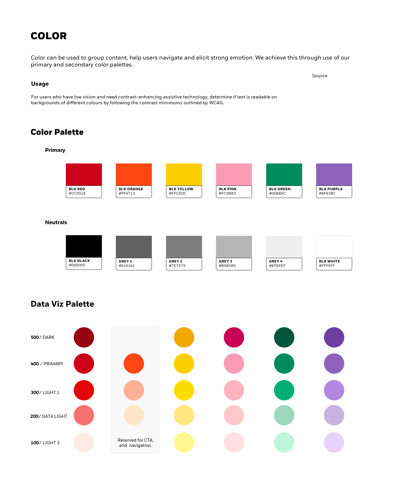
As part of BlackRock's rebrand in 2019, I scaled up marketing brand colors to a comprehensive color scheme for interactive tools. The color palette is an important grounding element in enabling power users to confidently advise clients.
I conducted Usability testing so that we could determine whether advisors could navigate the platform with ease with the updated color scheme. It was important to ensure that color was consistently applied across the 15 tools in Advisor Center.
ROLE
DESIGN LEAD:
Design Strategy
User Research
Interaction, Visual design
Prototyping & Testing
Pitching
Design Strategy
User Research
Interaction, Visual design
Prototyping & Testing
Pitching
STUDY DETAILS
PARTICIPANTS
The user testing was conducted over the course of 6 days. The participants were recruited using Respondent.
Participant variances:
• Years in industry
•Familiarity with tool
• Years in industry
•Familiarity with tool
Note: one participant had previously participated in User Testing for a different tool.
STUDY SURVEY
After testing concluded, commonalities were collected from the findings. Through the remote session we learned that many Advisors experience similar pain points with financial tools. The insights are recorded below:
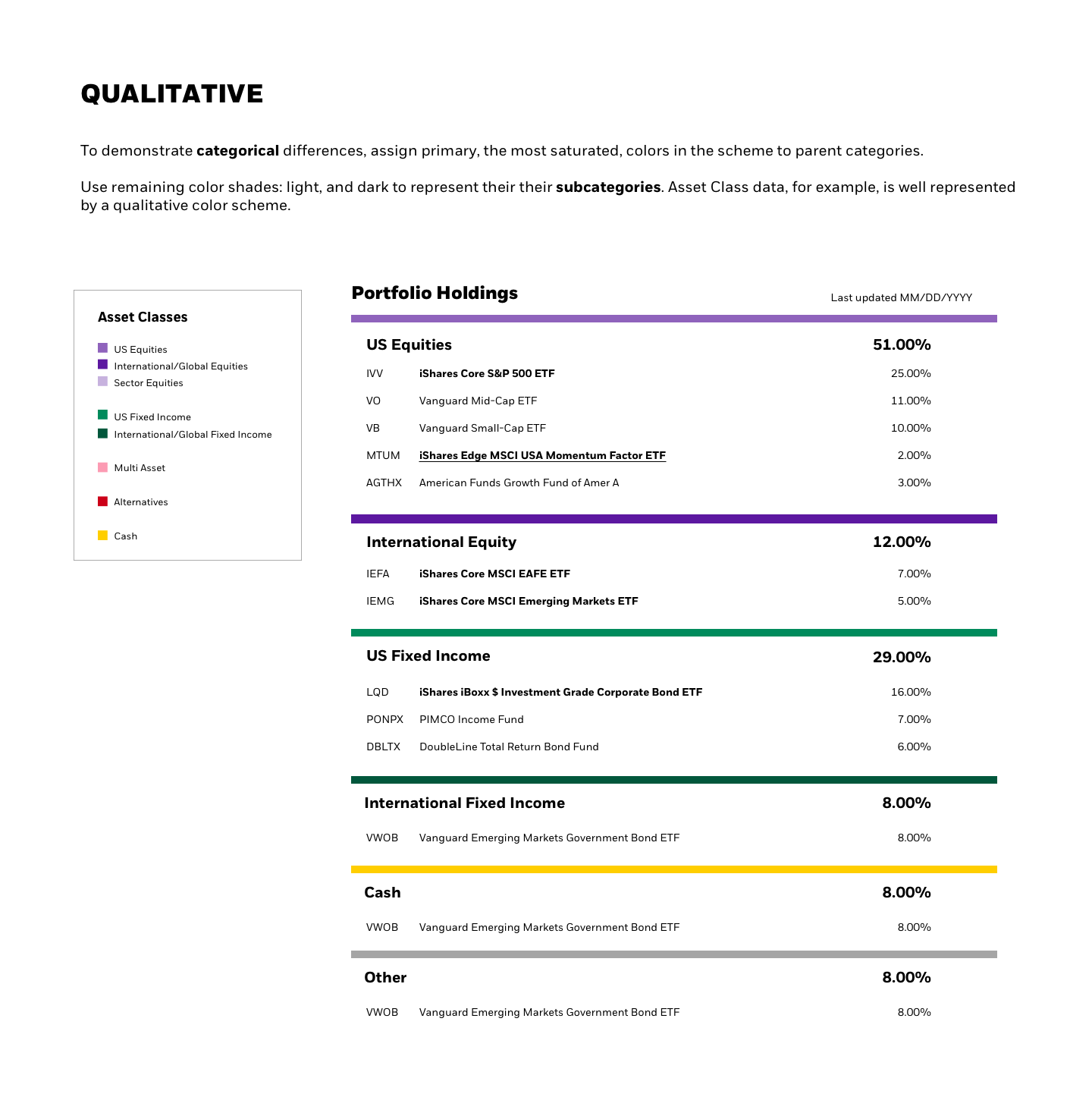
With the key takeaways in mind, I came up with an inexpensive solution for improving data visualization colors on the platform.
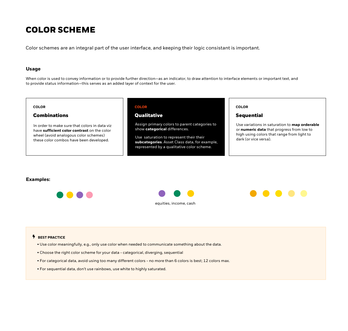
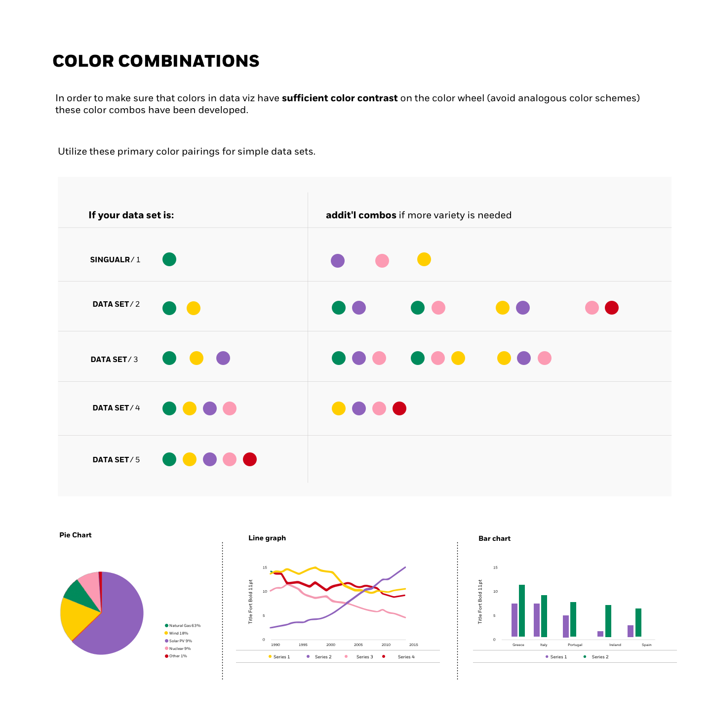
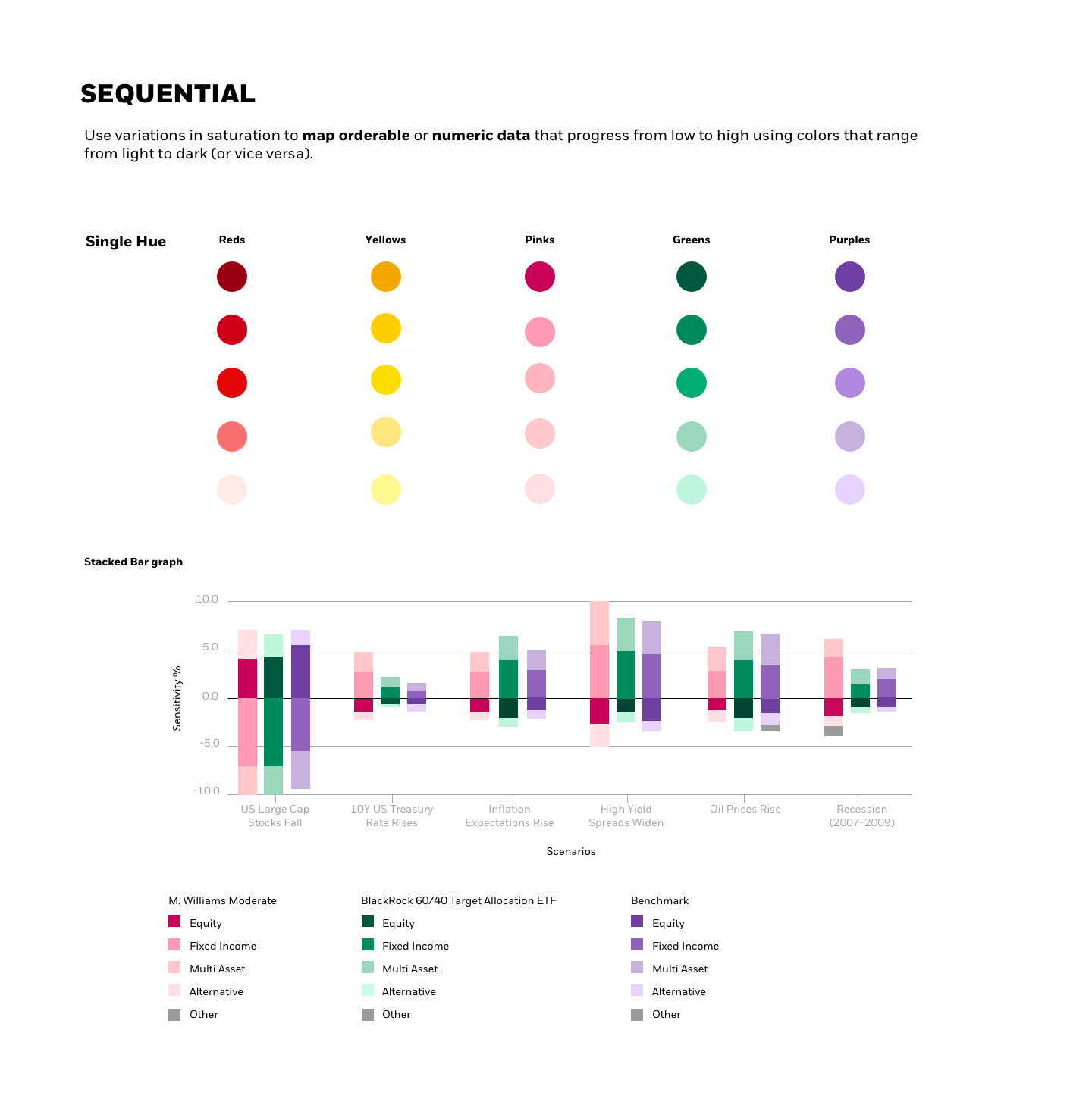
This research directly impacted how we use data viz color schemes across the platform. Here is a snippet of my work from the Daisy Design System Color section:
